The Harmony Project
Website case study
The Harmony Project: A Website Built Around Purpose, Learning and Nature
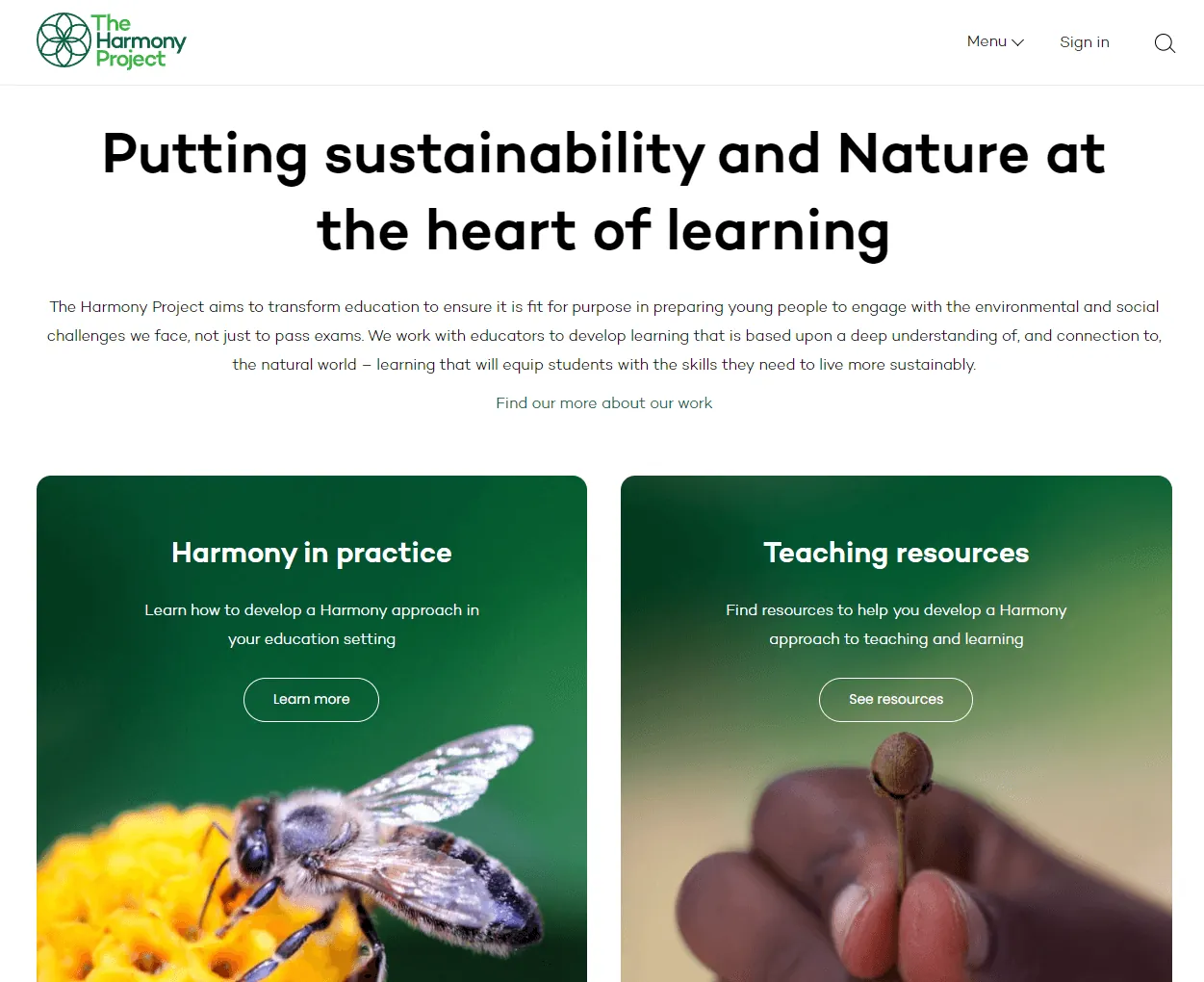
The Harmony Project helps educators put sustainability and Nature at the heart of learning. Its website has an important job: explain a thoughtful educational approach, guide teachers towards practical resources, and support a wider movement for change in schools.
This case study looks at how a purpose-led education website can connect mission, content and conversion paths without losing the warmth and depth of the organisation behind it.
The Harmony Project website
The Harmony Project
Education and sustainability
Teachers, school leaders and educators
Explain the approach, share resources and build engagement
The organisation
The Harmony Project works with educators to develop learning shaped by a deep understanding of, and connection to, the natural world. The organisation’s message is clear: education should prepare young people for the environmental and social challenges they face, not only for exams.
That gives the website a bigger role than a standard brochure site. It has to introduce an idea, build trust, support teachers with practical materials, and encourage people to stay connected through resources, newsletters, events and donations.

The website challenge
Purpose-led organisations often have a tricky website challenge. They need to explain rich, nuanced work without overwhelming first-time visitors.
For The Harmony Project, the website needs to serve several visitor groups at once:
- Teachers looking for practical curriculum support
- School leaders exploring a whole-school approach
- Educators interested in sustainability and Nature-based learning
- Supporters who may want to donate or follow the project
- People who have heard about Harmony and want to understand the idea
The site cannot rely on one generic call to action. It needs clear routes for different levels of intent: learn more, read guidance, explore resources, attend events, subscribe, buy resources or donate.
What the website does well
| Website area | Why it matters | Visitor intent served |
|---|---|---|
| Homepage positioning | It quickly introduces the core idea of putting sustainability and Nature at the heart of learning. | Understand the mission |
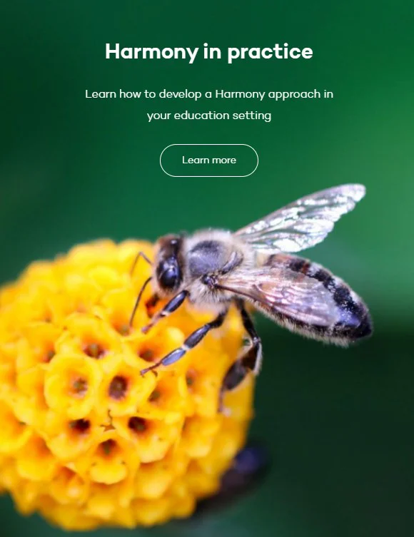
| Harmony in practice | It turns the philosophy into practical routes for curriculum planning, learning principles and whole-school development. | Explore implementation |
| Teaching resources | It gives educators a reason to return and a useful way to engage with the approach. | Find classroom support |
| Films and podcasts | It supports deeper engagement for visitors who want to hear and see the ideas explained. | Build confidence and trust |
| Newsletter and donation routes | It gives warmer visitors a next step beyond reading. | Stay connected or support the work |
Content structure and user journeys
The site works best when the visitor can move from belief to action in small steps.
A teacher who lands on the homepage may first need to understand what Harmony means. From there, they can move into the practical section, read articles, explore planning resources, and eventually use teaching packs or sign up for updates.
A school leader may follow a different route. They may start with the “Why Harmony?” page, then look at whole-school development, accreditation, events or the Teachers’ Guide.
That layered journey is important. Not every visitor is ready to donate, buy or sign up on the first page. Good content architecture gives people a sensible path based on how ready they are.

Conversion opportunities
For a charity and education resource website, conversion does not mean one single action. The right conversion depends on the visitor.
| Visitor type | Likely need | Best next action |
|---|---|---|
| First-time educator | Understand the Harmony approach | Read Why Harmony or watch an introductory film |
| Teacher planning lessons | Find practical classroom resources | Explore teaching packs, geometry activities or medium-term planning |
| School leader | Consider a wider school approach | Read whole-school guidance or explore accreditation |
| Warm supporter | Stay involved | Subscribe to the newsletter or donate |
The strongest improvement opportunity is to make those routes visible at key decision points. Every major page should answer: who is this for, what should they read next, and what action would help them move forward?
Recommended improvements
The site already has strong educational depth. The next gains are likely to come from making journeys clearer and measuring which actions matter most.
- Add clearer page-level calls to action on key educational pages
- Create audience routes for teachers, school leaders and supporters
- Use internal links to connect articles back to teaching resources and practical guidance
- Track newsletter sign-ups, resource downloads, product purchases, donations and contact enquiries
- Add concise summaries near the top of longer pages for first-time visitors
- Use case examples from schools to show the Harmony approach in practice
Summary
The Harmony Project website has a strong foundation because the organisation’s purpose is clear and the content has real educational substance. Its best opportunity is to make the visitor journey more deliberate: from understanding the idea, to exploring practice, to using resources, to staying involved.
For purpose-led organisations, that is where web design, content strategy and conversion planning meet. The website should not only look good. It should help the right people find the right path into the work.
Need a clearer website journey?
If your organisation has strong content but visitors are not taking the next step, Ace Web Studio can help review the structure, calls to action and conversion paths across your website.
We focus on websites that do more than look tidy. They need to explain the offer, guide the visitor and support the goals behind the organisation.
- Clients:
The Harmony Project - Category:
Business - Date:
Dec 2019